In a recent conversation with a fellow National Academician, architect Paul Broches (NA 2013), I learned that he had designed a gallery for a university campus in Brooklyn. As he described its particular challenges and innovative qualities, it began to sound familiar, until I realized it was the same gallery where the artist (and my husband) Don Porcaro (NA 2018) had exhibited a site-specific sculptural installation in 2012.
Since our inception in 1825, the National Academy of Design’s membership has distinguished itself in large part by the pairing of artists and architects, providing unique opportunities for conversation and collaboration among disciplines.
Unlike our forebears, from ancient Egypt, to Greece, Rome, and the Renaissance, whose work encompassed a holistic practice, artists and architects today work more often in silos of specialization. Creative production is driven by the individual, and it’s precisely because of this isolated practice that collaboration today is more generative than it ever could have been in the past.
Sometimes, one’s work inspires another artist or architect, with one work preceding another and the element of time and chance playing a role in the creation of something unanticipated—not a collaboration so much as an interesting and, indeed, happy coincidence.
For Paul Broches, designing the gallery he described to me in that conversation had its challenges. In 2002, he and his firm, Mitchell Giurgola Architects, embarked on a campus planning study and space analysis of the nine-story Arnold and Marie Schwartz Building for the Humanities at Long Island University’s Brooklyn campus. It was to be a fairly large undertaking, encompassing the re-thinking of faculty offices, classrooms, and meeting spaces for eight departments, including dance studios, music practice rooms, and a performing arts theatre. A significant addition to the plan was a visual arts gallery that would be incorporated into the lobby of the building. But how best to do that while keeping the lobby space visually open, and without resorting to the usual scant and uninteresting availability of existing white walls?
Broches came up with an innovative idea, which was to build a glass enclosure in the center of the space, curling in and around four large, round, concrete columns. This would not only create a gallery space, but circumvent visual obstruction from solid walls. Transparency would create a connection between the gallery and its surroundings.
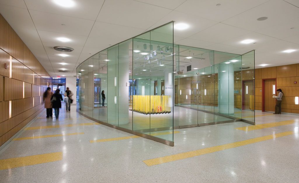
And so, the Humanities Gallery at LIU, Brooklyn, has since its inception maintained a robust program of dynamic installations and exhibitions by nationally- and internationally-known artists. In 2012, Don Porcaro was invited to exhibit there. Generally known for his free-standing and often large-scale vertical sculptures composed of stacked layers of stone, Porcaro felt that this particular site presented him with an opportunity to create a site-specific installation of a different sort: one that would encompass color and multiple units that could fill the large space but, like Broches’s design, not obstruct the view or the light.
He was also aware that the location inside an institution of higher learning offered the chance to address some of the pressing issues of the day. What could he show in this glass bubble that would entice viewers visually while also inspiring them to engage on a deeper level? His solution on one hand was to go horizontal, rather than vertical; to cover the floor with enough individual units to fill the entire space, so much so that the viewer would be forced to engage with the work from the outside only, as one would peer into a museum or library vitrine. On a conceptual level, what would these units represent and what would they look like?
I engaged Porcaro and Broches in a conversation to find out how their ideas ultimately found common ground.
Leslie Wayne: Paul, I know you have always had an interest in collaborating with artists. Even though the design of this gallery was not a “real time” collaboration, were you trying to imagine it from an artist’s point of view; that is, how one could be challenged to exhibit there differently than in other gallery spaces you’ve designed? Or, was it strictly a practical solution to an architectural challenge?
Paul Broches: I had several goals. First, I felt that entering the building’s lobby should be a welcoming, dynamic, and uplifting arrival for the hundreds of students and faculty who go there every day. Second, I thought the space they would pass through to elevators and stairs in this nine-story building should be loaded with content. Even if passersby have their minds elsewhere, they might slow down to take in the goings on. The art gallery stands in the middle of the lobby, commanding attention like a town square, surrounded by a dance studio with small windows to peek in like we often see at construction sites and music listening and ensemble practice rooms from which one hears faint sounds wafting into the Lobby. The box office and gathering space for audiences attending two small theaters merge with the lobby. Being on the ground floor of the building means a constant flow of the LIU community nearly 24 hours a day.
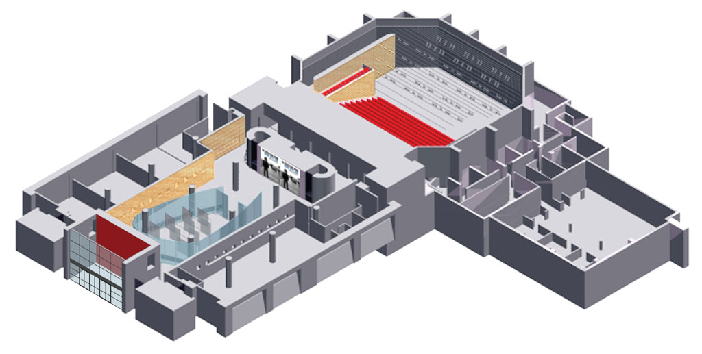
Practicality always enters the design process. With respect to the gallery, for example, there was no budget for staff to maintain extensive visiting hours. Often the gallery is locked; therefore, transparency is critical to maintain a visual experience for passersby day and night. Would the artists take into account these different experiences—that the work would sometimes be seen as an object behind glass, and sometimes be viewed up close inside the walls?
Another practical matter was the lighting system. While it provided flexible track lighting, the artists and/or curators must light the work in a way that will not hinder viewers. In this direct way, and others more subtle, arranging a show where the viewer experience is connected with the work entails dealing with ever-changing circumstances within the space and around it.
I wondered whether the gallery would encourage artists to experiment and take their work to another place, with the comfort that they could return to a “before,” perhaps with greater conviction.
Don, how did your encounter with the gallery go?
Don Porcaro: It’s interesting that you described the gallery as commanding the space like a town square. I conceived of an installation that filled it like a crowd of hundreds in a town square. As a sculptor, I always consider a space in terms of its square footage and its characteristics as a three-dimensional environment. When I was contemplating how my work would look in your gallery, my initial consideration was about the shape of the space as defined by the glass enclosure, which was unusual, and about the square footage of the floor. But the transparency of the gallery kept presenting itself as an opportunity to come up with something different. I started thinking of a vitrine and the way it holds objects that can be viewed but not touched. What would I do that would justify keeping the doors locked so that the work would only be viewed from the outside? It was an interesting challenge.
Coincidentally, right around that time, the world population had just reached 7 billion. The idea of overpopulation and its consequences was a subject worthy of exploration, and certainly already in debate at the university—mass migration, hunger, disease, and political upheaval. What does it mean to live in a world filled with more people than it can support?
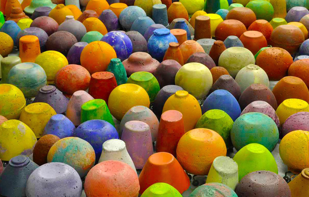
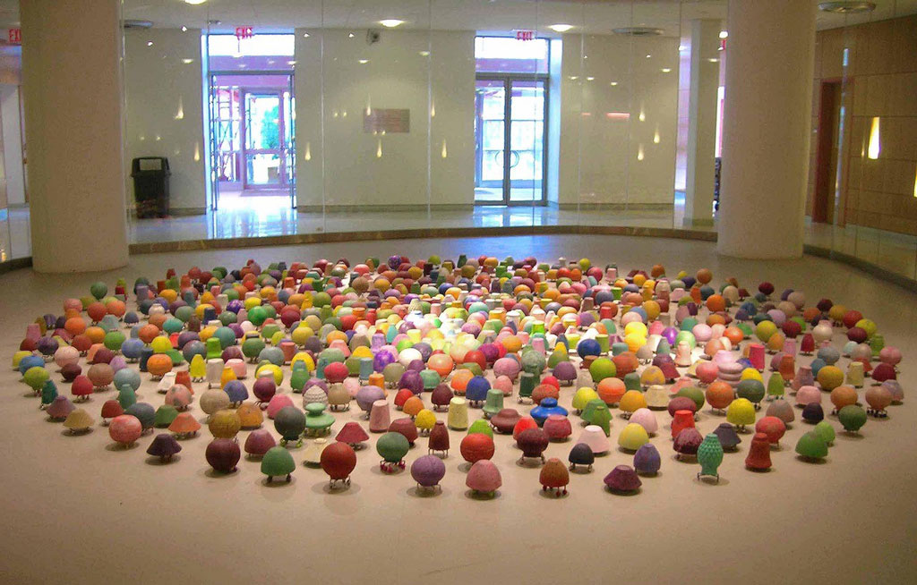
I started to think about the gallery as a vitrine that could barely contain its own contents—an overpopulated space. Then the concept started to come together. I ended up making 700 small works, each representing 10 million people. They each have four feet painted a different color. When I placed them on the floor, they made a 25-foot circle that was a mass of color, just like a crowd in a town square, filling the space almost entirely from wall to wall.
Wayne: So, while this was not really a collaboration with Paul, the unique architecture of the gallery was generative in a way that inspired you to come up with an idea that was outside what you were normally engaged with in the studio. Is that right?
Porcaro: That’s exactly right.
Broches: Yes, and designing the gallery was not an artist-architect collaboration as we usually think of them. On the other hand, as I explored different forms for the free-standing structure, I came to rest on an organic shape that would facilitate movement for the public and, at the same time, present a challenge to the artists who would be invited to inhabit it. As has been the case for the 18 or so years that the gallery has been open, each artist who exhibits there is inevitably affected by the form and transparency of the space. Nearly every exhibition uses the space differently. To me, it is a good measure of its success that artists take ownership over it and, effectively make it part of their project.
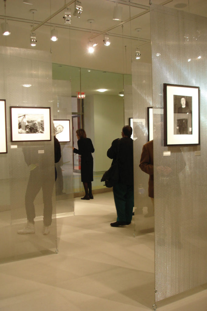
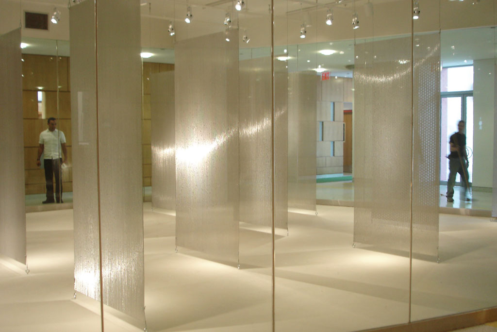
Porcaro: I had already visited several installations at the Humanities Gallery by the time I was invited to exhibit and had seen artists do all sorts of things. Some treated the space like an aquarium, others fastened things from the ceiling, and some used the draw-down walls to hang paintings. Though, I think the space is uniquely suited to sculpture.
Broches: Because the gallery is frequently locked, there is a strong sense of inside and outside.
Porcaro: Yes, and I wanted not only to take advantage of this unusual aspect, but to justify its being locked. My works literally filled the space to the point where one could not easily walk around them anyway.
Wayne: Has this experience changed the way either of you think about your work in terms of its relationship to the other’s discipline? Does it make you want to collaborate more intentionally?
Broches: My office and I, personally, have been fortunate to have partnered with artists on collaborative projects in real time, where the design of the landscape, building, or interior develops iteratively with the artist’s development of their intervention. Invariably, solutions emerge that neither artist nor architect would have come to on our own. In some cases, we had a hand in selecting the artist, or vice versa, and in others, a client or art consultant proposed the “marriage.” Among National Academicians, we have worked on two outdoor projects with Martin Puryear (NA 2014), indoor and outdoor projects with Ned Smyth (NA 2016), and indoor projects with Michelle Stuart (ANA 1994; NA 1994) and Valerie Jaudon (NA 2011). These direct and interactive collaborations have been very satisfying and I hope to have the opportunity to do more.
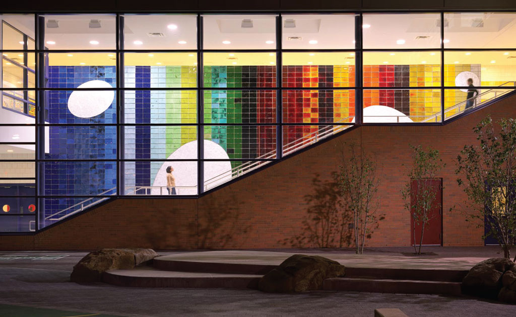
I believe that architecture developed in collaboration with and in response to an artist’s work is thought-provoking during the process and often enriches each other’s contribution in the final outcome. Even with the silent conversation with Don over a period of ten years before we met, much was communicated! I hope soon to start a retrospective collaboration involving a series of WPA-era murals for the preservation and the adaptive re-use of the spaces in which they reside. The artists will speak to us loud and clear daily as we work through the design process—I hope as fruitfully as the LIU gallery spoke to Don.
Porcaro: For me, it was indeed fruitful, and a signal experience. I’ve exhibited in many spaces over the years, both indoor and outdoor, but this was the first time I was presented with a space that was so particular in its shape and character that it required me to rethink my work in a fundamental way. It launched the next several years into a new direction.
While I have not had the pleasure of collaborating directly with an architect, I recently completed a public commission for NJ Transit’s Jersey Avenue Light Rail station in Jersey City, an outdoor platform that gets a huge amount of daily traffic. On a purely practical level, I had to consider safety, and which materials could stand up to extreme weather conditions.
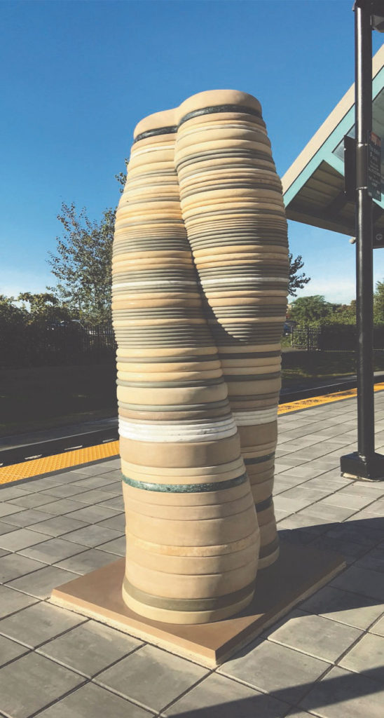
Conceptually, coming up with an aesthetic articulation of an idea that would be meaningful to the commuters was exciting, but also challenging in a similar way to the LIU Humanities Gallery experience. I had to consider that my work would be in dialogue with two gates created by Fred Wilson (NA 2013) at either end of the platform that were part of the station’s original design. They incorporate a quote by the abolitionist John Woolman: “We are subject to the like afflictions and infirmities of body, the like disorders and frailties in mind […] the same death, and the same judgement.” The platform faces a large hospital to the north, and in keeping with the visual sightlines and the conceptual theme of equality established by Wilson, I built a free-standing, upright sculpture in the form of a combined caduceus and DNA strand. Titled All Of Us, the stacked layers of marble and stone come from all over the world, celebrating the beauty of diversity and the strength in standing together.
The challenges of working in public art are demanding, but also extremely gratifying, and I hope to do more in the future.
Leslie Wayne (NA 2016) is a New York based artist, and occasional writer and curator. She has received numerous awards for her painting, including grants from the John Simon Guggenheim Foundation (2017), the Joan Mitchell Foundation (2012); the NY Foundation for the Arts (2018, 2006) and the Adolph and Esther Gottlieb Foundation (1994). She has exhibited widely throughout the United States and abroad and is represented by Jack Shainman Gallery.
Paul Broches (NA 2013) is a partner at Mitchell Giurgola Architects and a Fellow of the American Institute of Architects. His work begins with architecture as a social art. Designs are informed by a dedication to the craft of building, the frequent involvement of artists in the design process, and by collaboration among MG colleagues. Broches is a member of the Berkeley Prize Committee, a national awards program for undergraduate students intended to foster architecture as a social art through research, writing and criticism; and the Goodman Fellowship Selection Committee at Columbia University Graduate School of Architecture Planning and Preservation.
Don Porcaro (NA 2018) is a sculptor whose work explores the nature of human interaction with the physical world through the language of architecture and man-made objects. He has exhibited widely throughout the U.S. and abroad and is the recipient of grants from the Pollock-Krasner Foundation, NY Foundation for the Arts, and NY State Council on the Arts. Porcaro is Professor Emeritus in Fine Arts at Parsons School of Design and is a recipient of their Teaching Excellence Award. He serves on the Advisory Board for the Hell’s Kitchen Artist Coop and is a member of the Abstract Artists Association.
